
ဖိုင်:2021 Death rates, by energy source.svg

Size of this PNG preview of this SVG file: ၈၀၀ × ၄၅၀ ပစ်ဇယ်. အခြား ပုံရိပ်ပြတ်သားမှု: ၃၂၀ × ၁၈၀ ပစ်ဇယ် | ၆၄၀ × ၃၆၀ ပစ်ဇယ် | ၁၀၂၄ × ၅၇၆ ပစ်ဇယ် | ၁၂၈၀ × ၇၂၀ ပစ်ဇယ် | ၂၅၆၀ × ၁၄၄၀ ပစ်ဇယ် | ၁၂၀၀ × ၆၇၅ ပစ်ဇယ်။
မူရင်းဖိုင် (SVG ဖိုင်, ၁၂၀၀ × ၆၇၅ pixels ကို အကြံပြုသည်, ဖိုင်အရွယ်အစား - ၃ KB)
| ဤဖိုင်သည် Wikimedia Commons မှဖြစ်ပြီး အခြားပရောဂျက်များတွင် သုံးကောင်းသုံးလိမ့်မည်။ ယင်း၏ ဖိုင်အကြောင်းစာမျက်နှာ တွင် ဖော်ပြထားချက်ကို အောက်တွင် ပြထားသည်။ Commons သည် မူပိုင်ခွင့်လွတ်လပ်သော မီဒီယာဖိုင်များ သိုလှောင်ထားရာ နေရာ ဖြစ်သည်။ သင်လည်း ပါဝင်ကူညီနိုင်ပါသည်။ |
အကျဉ်းချုပ်
| ဖော်ပြချက် |
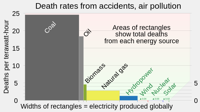
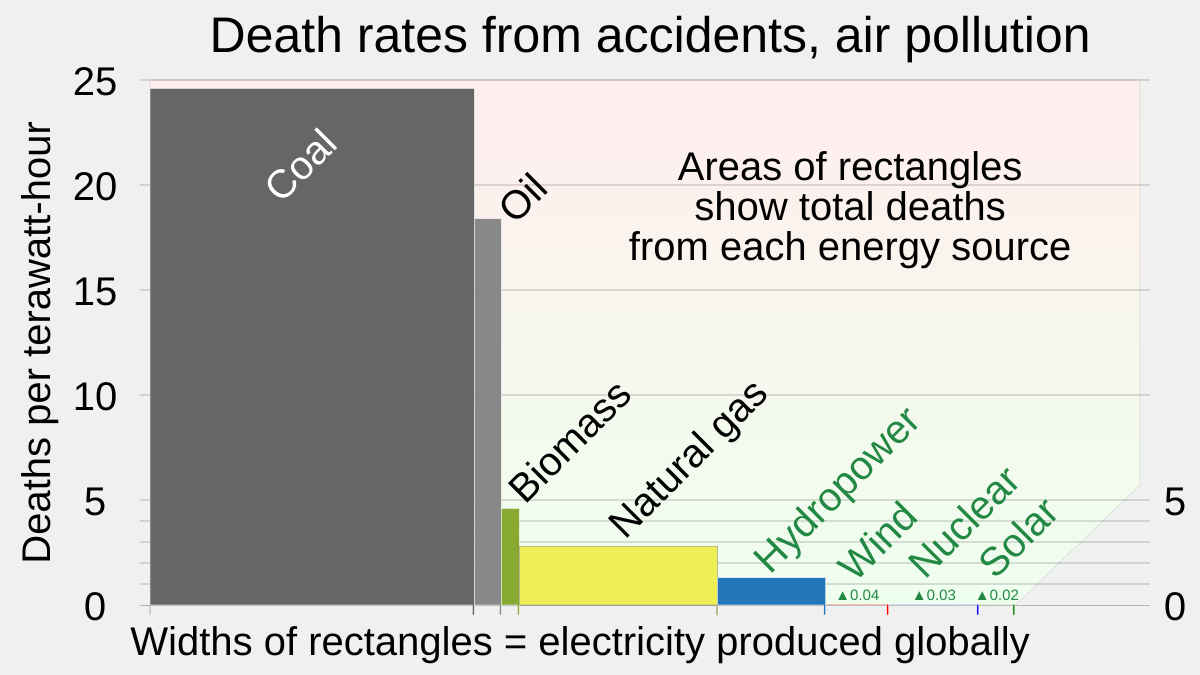
English: Chart showing relation of death rates per unit of energy generated, total death rates, and energy produced globally, each as a function of energy type
|
||
| ရက်စွဲ | |||
| ရင်းမြစ် | ကိုယ်ပိုင်ဖန်တီးမှု | ||
| စာရေးသူ | RCraig09 |

လိုင်စင်သတ်မှတ်ခြင်း
ကျွန်ုပ်၊ ဤလုပ်ဆောင်ချက်၏ မူပိုင်ခွင့်ပိုင်ရှင်အနေဖြင့် ဤနေရာမှ အောက်ပါလိုင်စင်အောက်တွင် ထုတ်လွှင့်ပါသည်:
ဤဖိုင်သည် Creative Commons Attribution-Share Alike 4.0 နိုင်ငံတကာ လိုင်စင်အောက်တွင် လိုင်စင်သတ်မှတ်ထားပါသည်။
- သင်သည် လွတ်လပ်စွာ:
- မျှဝေရန် – ဖန်တီးမှုကို ကူးယူရန်၊ ဖြန့်ဖြူးရန်နှင့် ထုတ်လွှင့်ရန်
- ပြန်ရောနှောရန် – ဖန်တီးမှုကို ပြင်ဆင်ညှိနှိုင်းရန်
- အောက်ပါ အခြေအနေများတွင်:
- မှတ်ယူနိုင်ခြင်း – ပြောင်းလဲမှုများ ပြုလုပ်ခဲ့ပါက ဖန်တီးသူ သို့မဟုတ် လိုင်စင်ရှိသူမှ သတ်မှတ်သော အမျိုးအစားကို လိုက်နာရမည် (ဆိုလိုသည်မှာ သင့်အား သို့မဟုတ် သင့်ဖန်တီးမှုတွင် အသုံးပြုခြင်းအား ထောက်ခံချက်ပေးသည်ဟု မဆိုလိုပါ)။
- ထပ်တူမျှဝေ – ဤဖန်တီးမှုအား ပြင်ဆင်ခြင်း၊ ပြောင်းလဲခြင်း သို့မဟုတ် ထပ်ဆင့် ဖန်တီးခြင်း ပြုလုပ်ပါက ရရှိလာသော ဖန်တီးမှုကို ဤဖန်တီးမှုနှင့် သို့မဟုတ် ဆင်တူသော လိုင်စင်ဖြင့်သာ ဖြန့်ချိသင့်သည်။
ဖိုင်မှတ်တမ်း
ဖိုင်ကို ယင်းနေ့စွဲ အတိုင်း မြင်နိုင်ရန် နေ့စွဲ/အချိန် တစ်ခုခုပေါ်တွင် ကလစ်နှိပ်ပါ။
| နေ့စွဲ/အချိန် | နမူနာပုံငယ် | မှတ်တမ်း ဒိုင်မန်းရှင်းများ | အသုံးပြုသူ | မှတ်ချက် | |
|---|---|---|---|---|---|
| ကာလပေါ် | ၁၉:၁၈၊ ၁၀ ဖေဖော်ဝါရီ ၂၀၂၄ | | ၁၂၀၀ × ၆၇၅ (၃ KB) | RCraig09 | Version 2: change "energy" in horizontal axis label to "electricity" to match chart in source's description . . . . see also Talk Page here |
| ၀၆:၅၆၊ ၁၆ ဇန်နဝါရီ ၂၀၂၄ |  | ၁၂၀၀ × ၆၇၅ (၃ KB) | RCraig09 | Uploaded own work with UploadWizard |
ဖိုင်သုံးစွဲမှု
ဤဖိုင်ကို အသုံးပြုထားသော စာမျက်နှာများမရှိပါ။
ဂလိုဘယ် ဖိုင်သုံးစွဲမှု
အောက်ပါ အခြားဝီကီများတွင် ဤဖိုင်ကို အသုံးပြုထားသည်-
- en.wikipedia.org တွင် အသုံးပြုမှု
- ro.wikipedia.org တွင် အသုံးပြုမှု